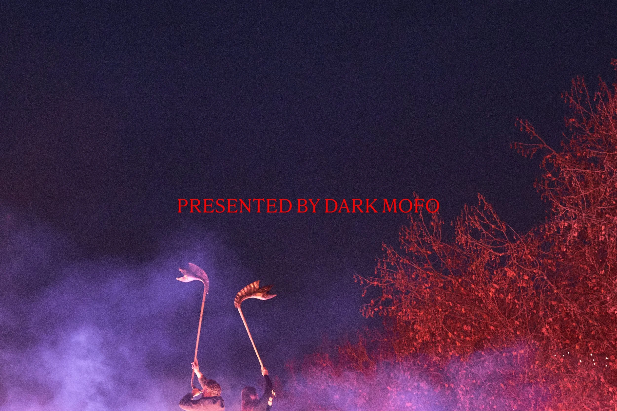
WINTER 2024 — PRESENTED BY DARK MOFO
Dark Mofo is an annual mid-winter arts and culture festival held by Mona in Hobart, Tasmania. In 2024 the festival took a break to re-group. Sort of. The focus was re-directed towards a smaller number of events emblematic of Dark Mofo as a whole; Winter Feast, Nude Solstice Swim, Night Shift, and a few key Mona events.


When reviewed in isolation, these events stand strong. They are compelling, unique, high-quality events. For many, on a ‘full festival year’ Winter Feast or Nude Solstice Swim are the festival highlight. So in 2024, the opportunity was to give these events a platform to shine, and compel audiences to experience them in a year where they may very well be at their best. This meant dedicated branding and campaigns.
Each year Dark Mofo refreshes it’s brand identity within the realm of bold, red, black, and the cross motif. In 2024 for the festivals year off, DarkLab, the agency that produces Dark Mofo, engaged me for the task.


From the outset, the identity needed to feel like classic Dark Mofo, but new. It needed to lean very heavily into strong typography—with a preference for a gothic sans serif. And the solution needed to primarily present a black font on a red background.
The driving insight for the design and art direction was that winter never really takes a break in Hobart. So while Dark Mofo as we know it was technically taking a break, winter’s ever present nature was having it’s moment in the sun.
With ‘Winter’ acting as a sort of surrogate identity, the resulting brand and art direction leaned heavily into the distinctive Dark Mofo visual language whilst bringing about a fresh feast for the eyes through specific colour choices, typography usage, and image treatment.
We let audiences know that the Winter they’ve come to know and love hasn’t gone anywhere, it was just being prepared for them with some refined, fresh ingredients, by the same team that have delivered the goods time and time again.
A compelling, typographic solution was created by selecting Grotzec from Feliciano Type Foundry as the key typeface, specifically Grotzec XXX Condensed in black. Keeping it in the family, the lower level sub-headline typeface for the Winter Feast 2024 art direction was also Grotzec, this time in it’s singular condensed form and in demibold weight. Parnaso Petit, also by Feliciano Type Foundry, was selected for all body and detail copy, it’s high contrast and sharp details mean it’s perfectly situated in editorial style layouts.
Red, redder, black and white was the colour palette. It’s distinctive connection to previous Dark Mofo brand identities meant it was both an access point for audiences and a visual equity position for the brand to cement itself in.
The design of the website was typographically driven, with a secondary key focus on imagery. An impactful, editorial layout meant that all key information could be easily communicated and navigated.
The team at DarkLab rolled out all touch points of the brand, from the entirey of the website, to signage, out of home advertising, social media assets and more.
—
“Josie was a pleasure to work with, her easy going nature is in perfect balance with her professionalism, sharp wit, technical prowess and conceptual strength. Highly recommend for any project that requires depth, breadth and contemporary edge.”


CREDITS
Studio: DarkLab
Dark Mofo Artistic Director: Chris Twite
Creative Director: Leigh Carmichael
Project Lead: Raef Sawford
Art Director: Josie Young
Marketing Director: Drew Berridge
Designers: Lucas Moulton-Wotherspoon, Tara Britcliffe
Developers: Aden Narkowicz, Janne Helewaut
Photography Credits:
All images via Dark Mofo and DarkLab contracted photographers
Rémi Chauvin, Aiesha Hanson, Rosie Hastie, and Jesse Hunniford