SIAN FAY KERR
Sian Fay Kerr is a photographer whose work blurs the lines between art and advertising. Sian works with brands who want to creatively explore their visual worlds and push the boundaries of what still life and product photography can be.


“I’ve developed a distinct and recognisable photography style that elevates the brands I’m working with, creating the visual world they want to exist in. I’m concept led with a unique creative vision and I execute with a high level of technical skill. I have a strong sense of colour and how to layer it within an image to enhance the worlds I create.”
Sian engaged me to bring her brand up to speed with her output.
“My work will always be the focus point of my business and brand but I want to be able to translate it into a design identity that I can use to be visually recognisable and transport people into the Sian Fay reality.”
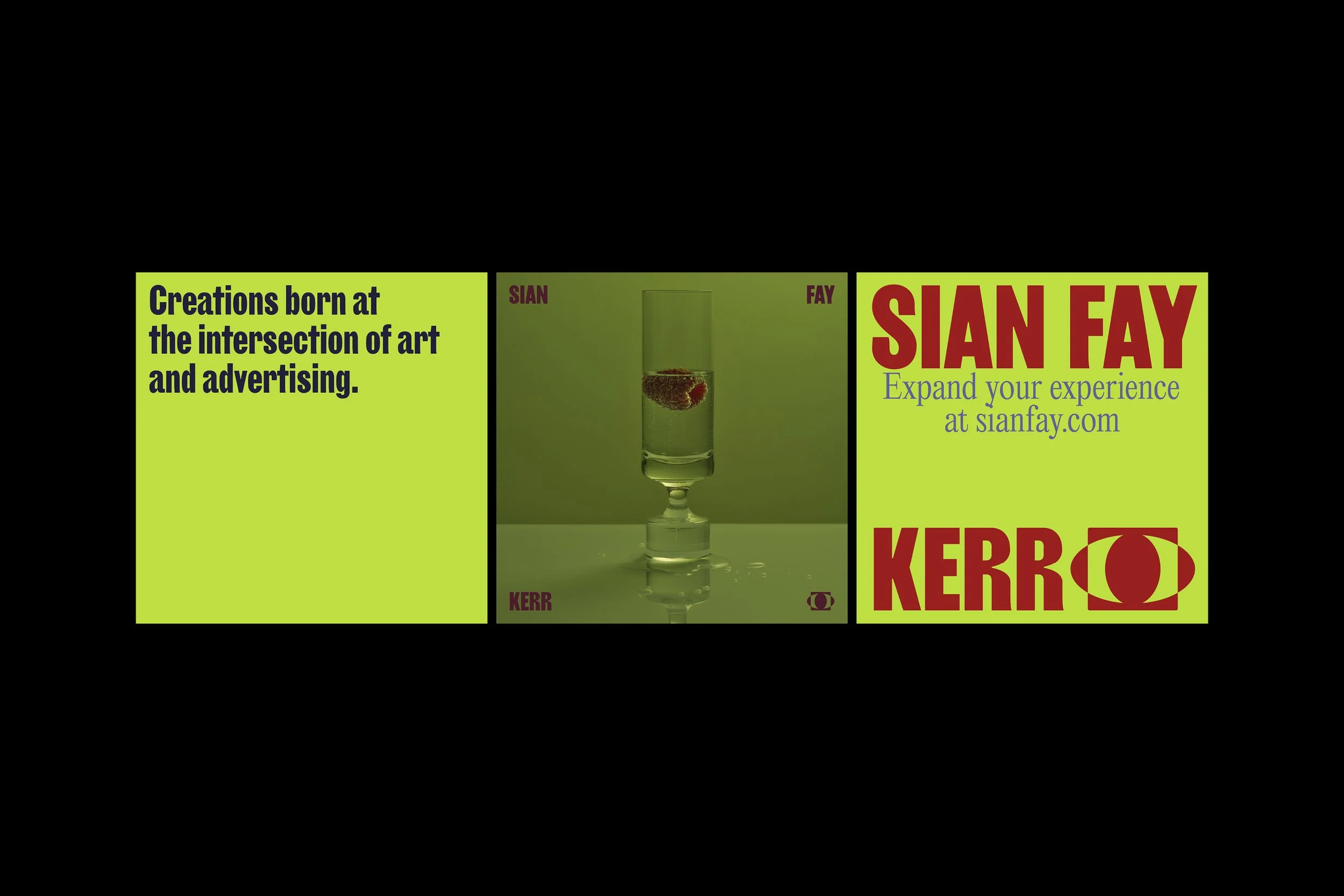
The resulting Sian Fay Kerr (SFK) brand universe is a flexible kit of parts. The primary purpose of the brand identity is to allow the multiple points of view created in the work of SFK to come to life, whether it’s the hyperreal cinematic worlds, or the lines being blurred between art and advertising, or a bit of everything and anything in-between and beyond.


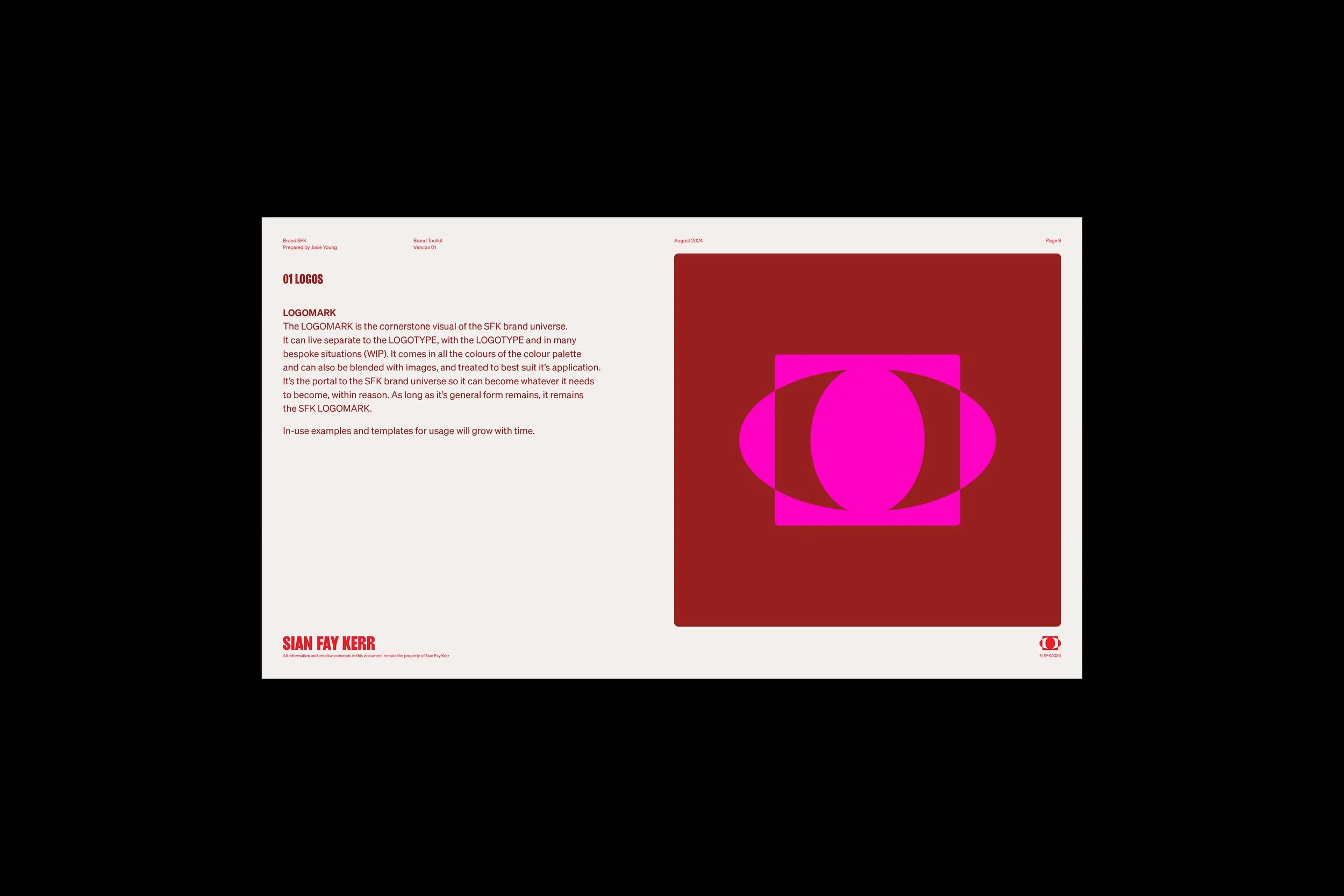
The logomark was borne out of a need to convey the unique perspective brought to every touchpoint in the work conceived by SFK. It’s made of three shapes that each represent an element of the work; the frame, the worlds and the point of view. These three shapes not only form the logomark, but can also be used individually as brand devices, frame devices and graphic devices in various ways throughout various applications.
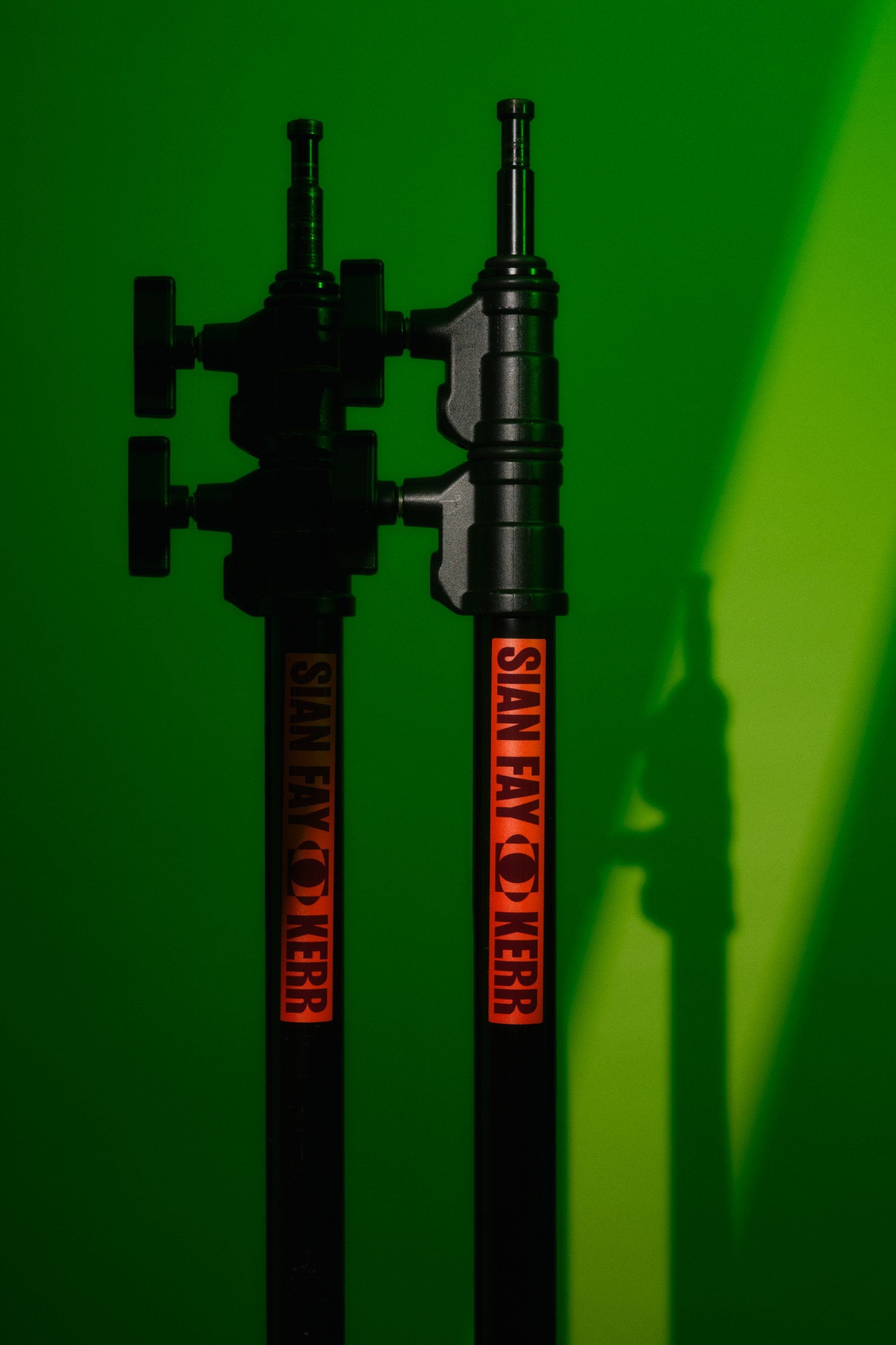
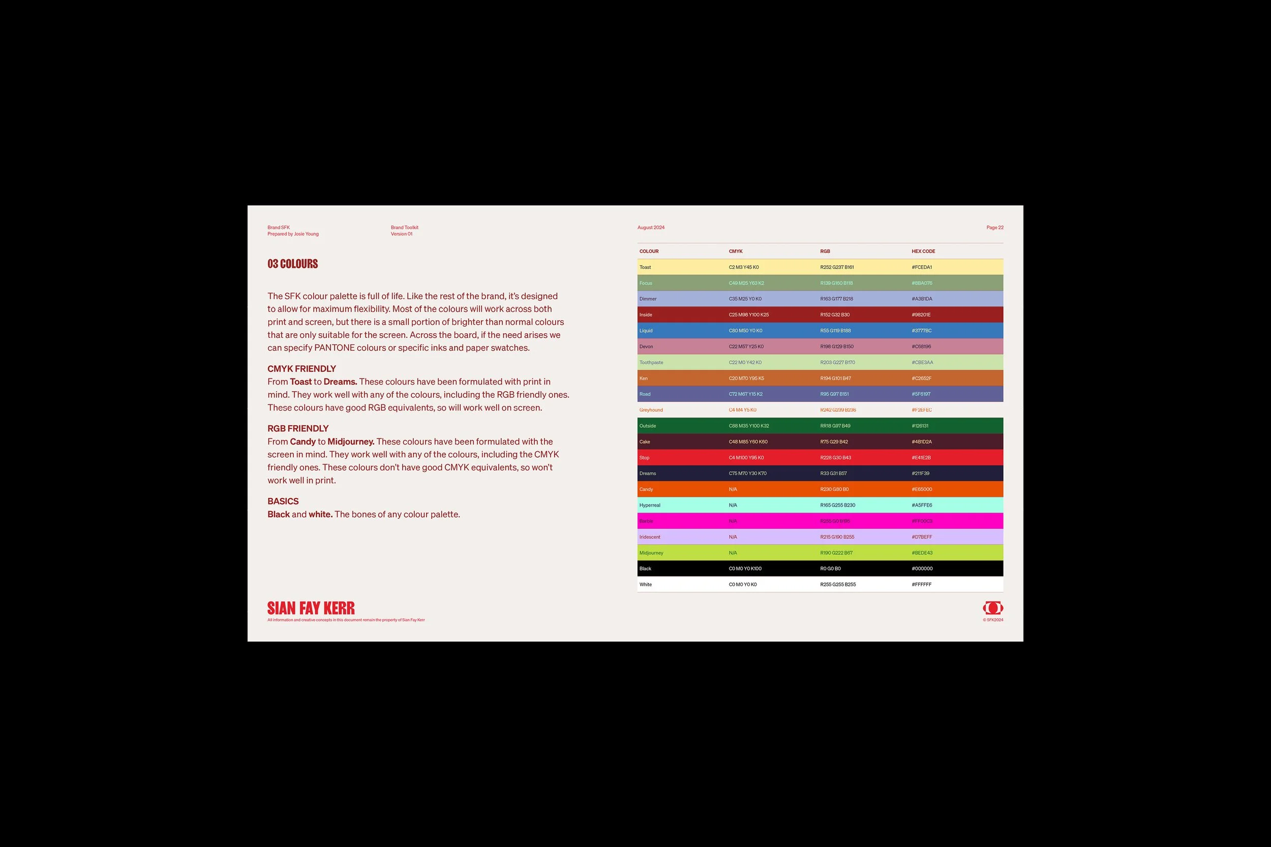
Paired with a bold and characterful typeface for the logotype, the suite of logos have been designed to allow for maximum flexibility and customisation while maintaining ease of use. The SFK brand fonts range from the powerful and bold, to the refined and sophisticated, to the functional and simple. The variety has been carefully curated to complement the flexibility across the rest of the brand as well as aid legibility across all applications. The SFK colour palette is full of life. Like the rest of the brand, it’s designed to allow for maximum flexibility.
Developed by Alana Wulff at Studio Himmel, the copy and tone of voice approach for the SFK brand universe is one of clear communication of services blended with the personality of Sian Fay Kerr.
An extensive suite of document templates was developed in addition to the core components of the brand. ‘The Everything Document’, a 16x9 document template in ten different colour palette combinations featuring more than 50 page layouts was crafted for the specific needs of Sian’s internal business practices. Social media templates with over 100 variations in layout, colour and copy were built alongside this.
“Working with Josie has been a creative delight from start to finish. She took the time to really understand my brand and what I wanted to achieve. Throughout the whole process Josie gave fantastic advice and direction, allowing me to really expand what I thought was possible. The finished visual language that Josie has created is incredibly sophisticated, functional and speaks to the core of who I am as a brand. Josie is simply brilliant - Hire her immediately.”


CREDITS
All photography – Sian Fay Kerr
Brand copy & TOV – Studio Himmel
Brand decals – Hectic Decals